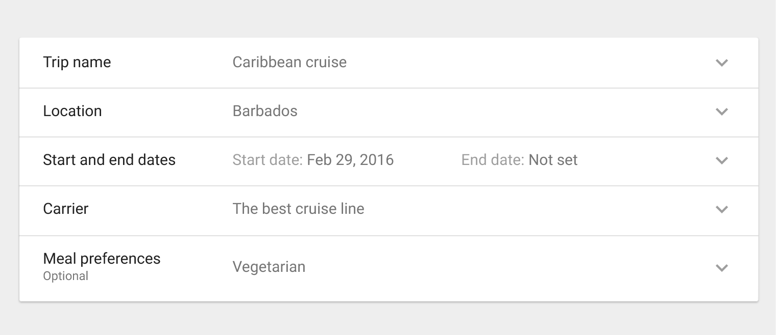
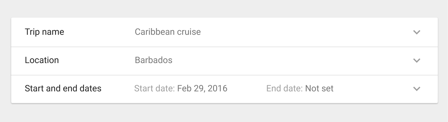
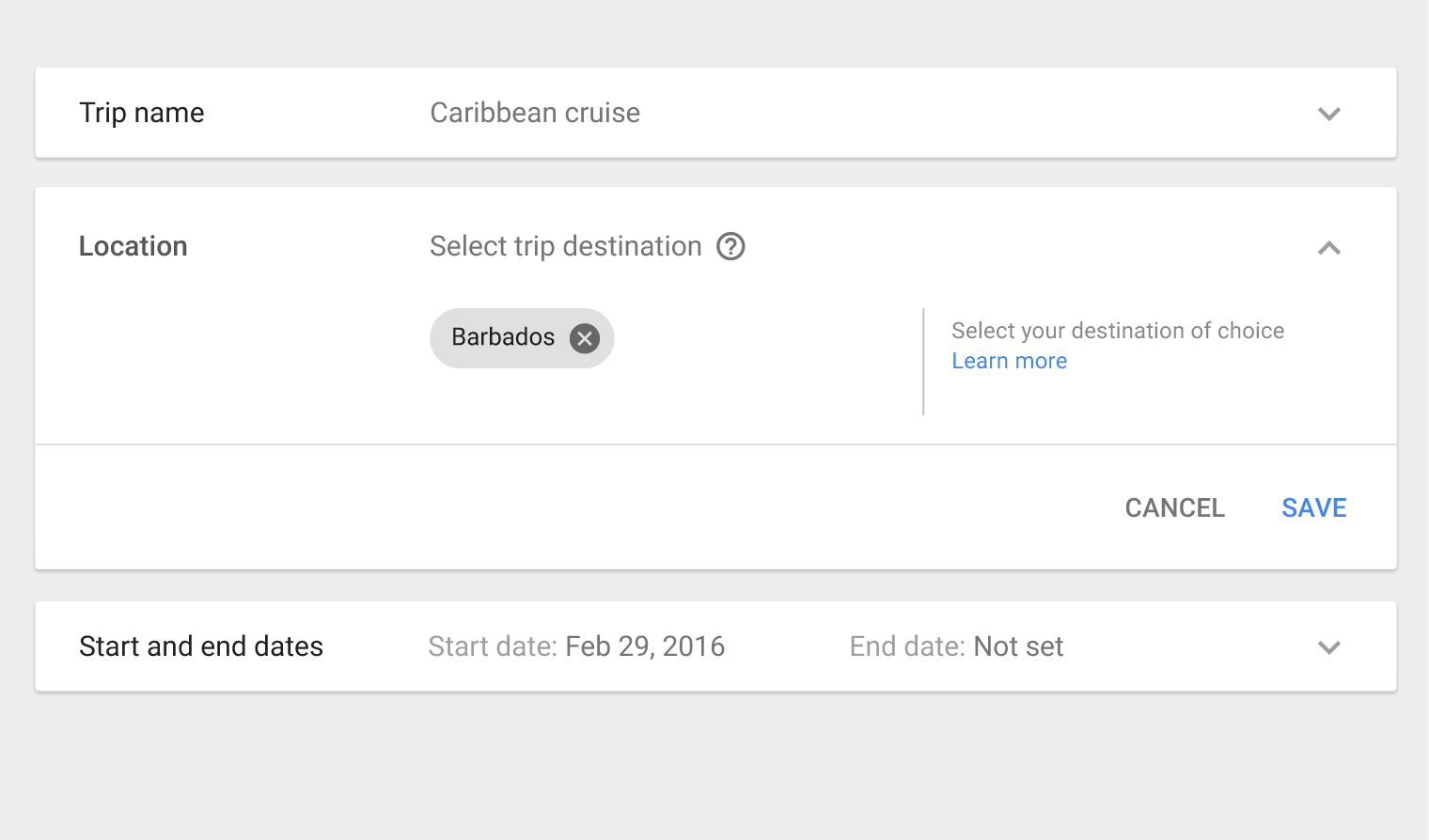
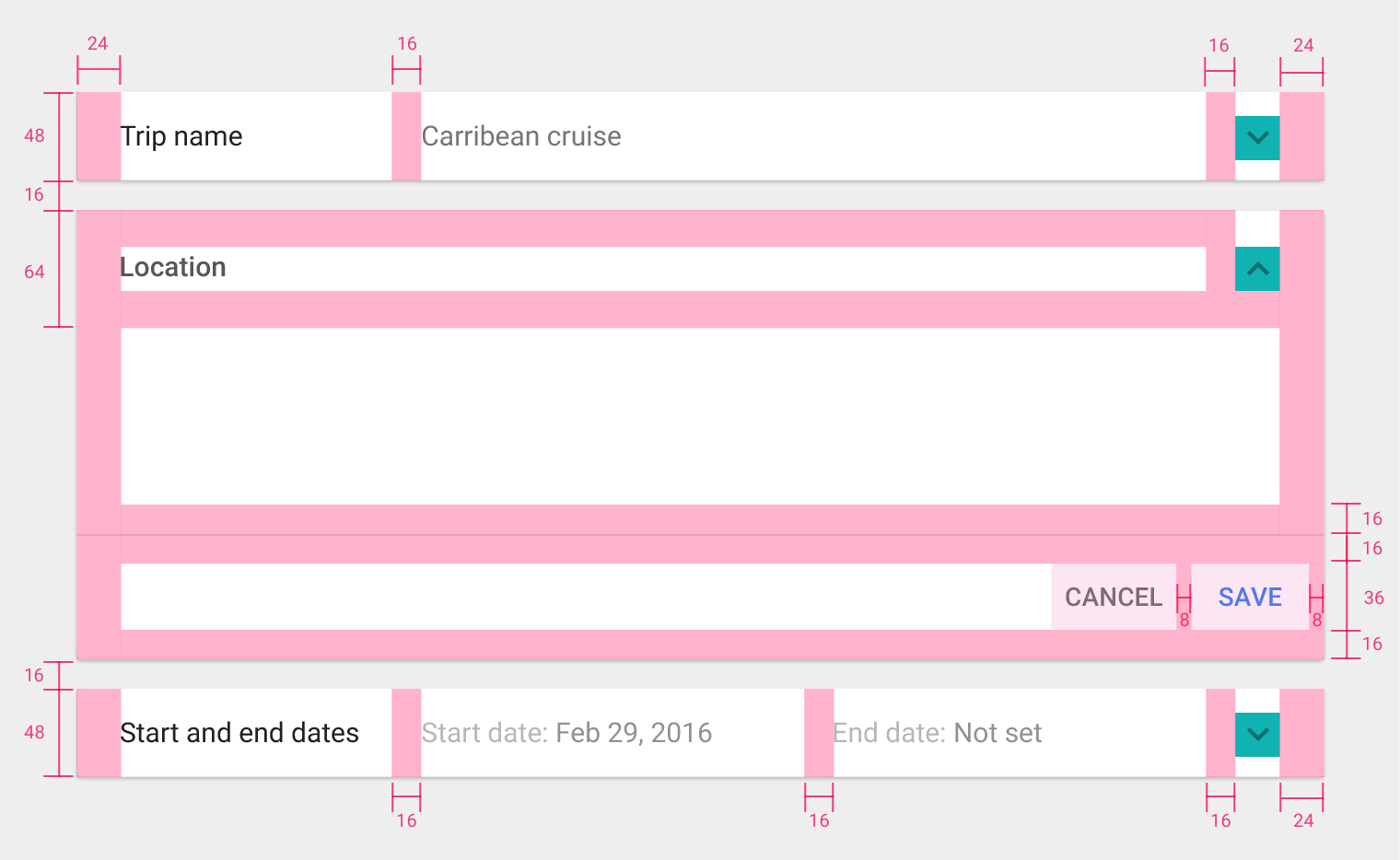
Expansion panels contain creation flows and allow lightweight editing of an element.
An expansion panel is a lightweight container that may either stand alone or be connected to a larger surface, such as a card.
They may be used for a variety of tasks, such as:
- To edit a setting
- To create a tool for ad campaigns
Usage
Editing
Creating flows
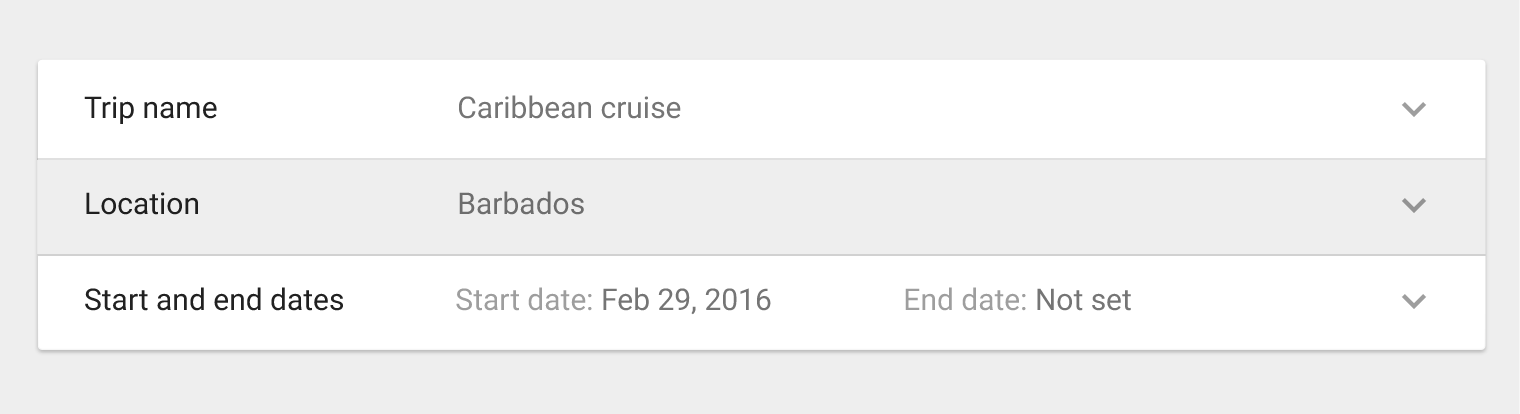
Behavior
Expand
Collapse
Focus