Components Pickers

Pickers

Pickers provide a simple way to select a single value from a pre-determined set.

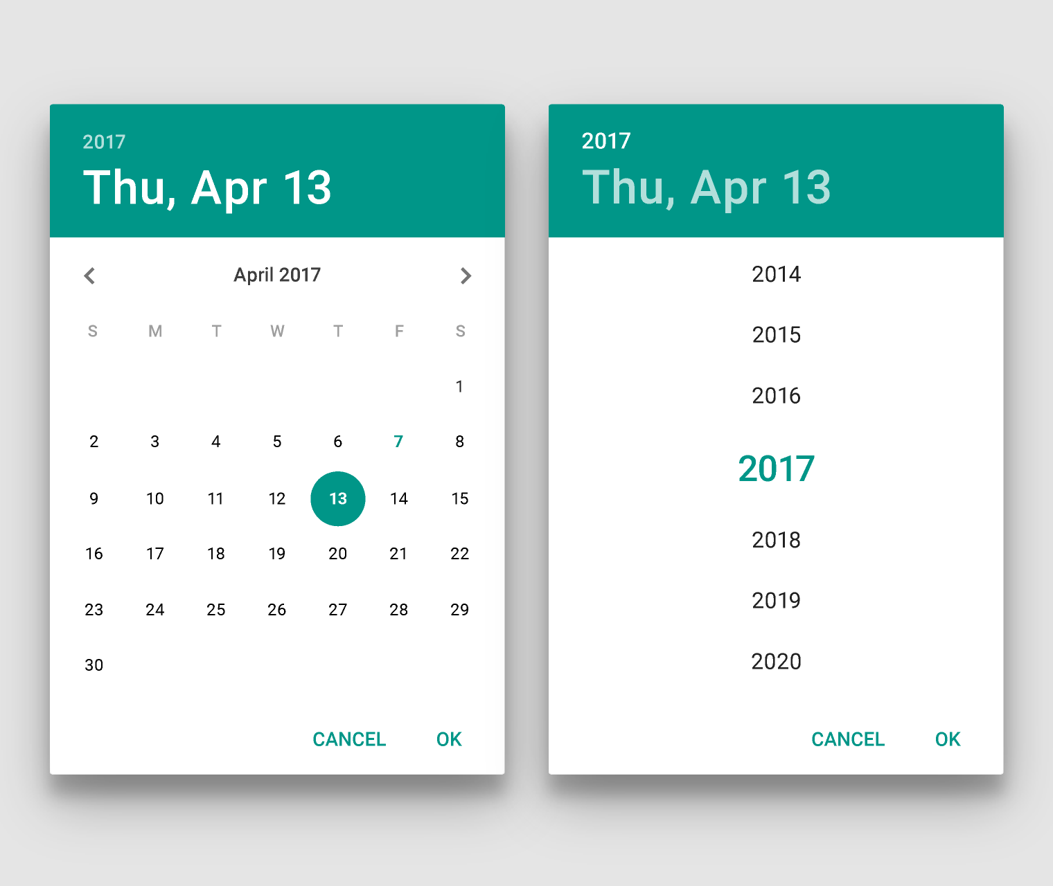
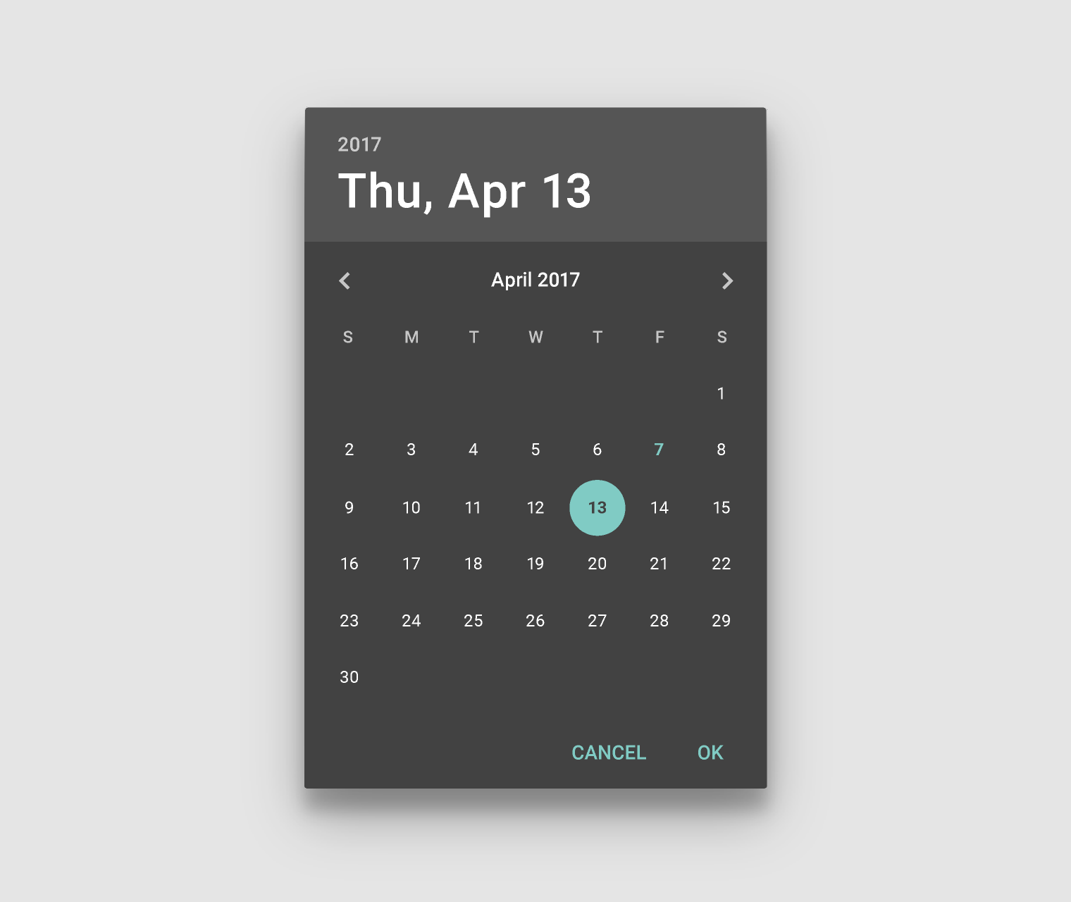
Date pickers use a dialog window to select a single date on mobile.

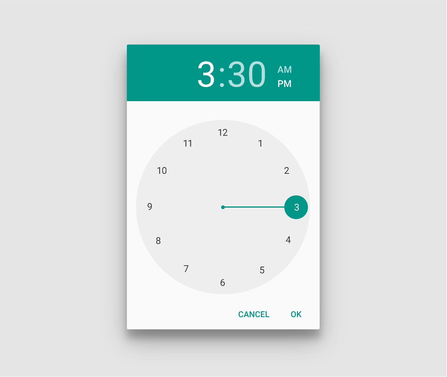
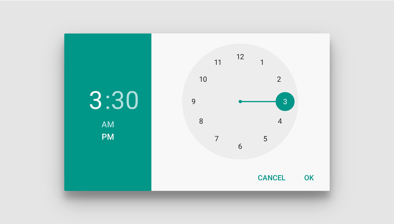
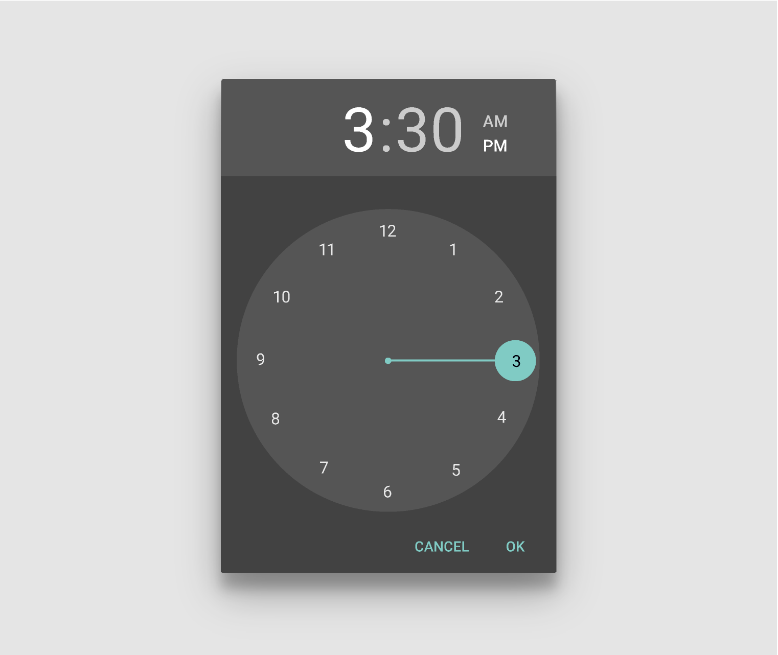
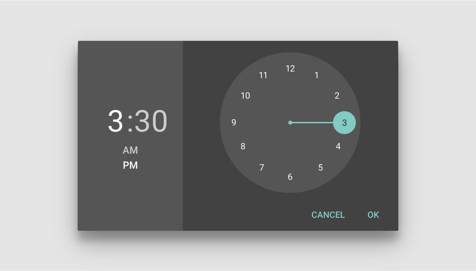
Time pickers use a dialog to select a single time (in the hours:minutes format) on mobile. They adjust to a user’s preferred time setting.

Material Design pickers for selecting single values

Usage Expand and collapse content An arrow that points down when collapsed and points up when expanded.

On mobile, pickers are best suited for display in a confirmation dialog.

For inline display, such as on a form, consider using compact controls such as segmented dropdown buttons.

Date pickers Expand and collapse content An arrow that points down when collapsed and points up when expanded.

A dialog picker is used to select a single date on mobile.

The selected day is indicated by a filled circle. The current day is indicated by a different color and type weight.

Material Design date and year picker in light theme

Date and year picker: Light theme, portrait

Swipe left to right to navigate through the months. Touch the year in the title bar to transition to the year view.

Date picker navigation

The picker view adapts to the device’s orientation.

Material Design Date Picker: Light Theme, Landscape

Date picker: Light theme, landscape

A dark theme picker can complement apps that have a dark theme.

Material Design Date Picker in Dark Theme

Date picker: Dark theme, portrait

Landscape view of the dark theme picker.

Material Design date picker in dark theme, landscape

Date picker: Dark theme, landscape

Time pickers Expand and collapse content An arrow that points down when collapsed and points up when expanded.

A time picker adjusts to a user’s preferred time setting, i.e. the 12-hour or 24-hour format.

A dialog picker is used to select a single time (hours:minutes) on mobile.

The selected time is indicated by the filled circle at the end of the clock hand.

Material Design time picker in light theme, portrait

Time picker: Light theme, portrait

Tap between the hour and minute label in the title bar to switch between the hour or minute view. Additionally, tap on the AM/PM label in the title bar to switch between AM or PM (in 12-hour clock mode).

Time picker navigation

The picker view adapts to the device’s orientation.

Material Design Time Picker: Light Theme, Landscape

Time picker: Light theme, landscape

A dark theme picker can complement apps that have a dark theme.

Material Design dark theme time picker

Time picker: Dark theme, portrait

Landscape view of the dark theme picker

Material Design Time Picker: Dark Theme, Landscape

Time picker: Dark theme, landscape