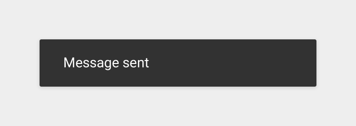
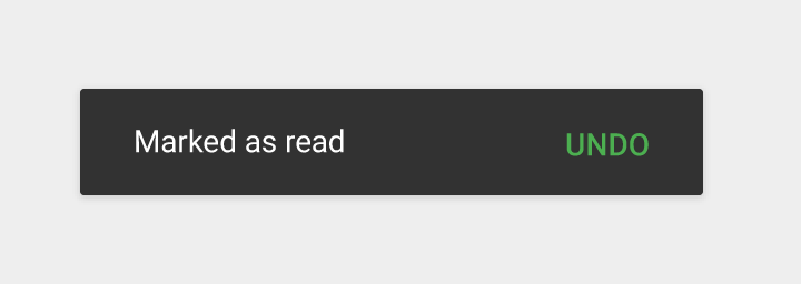
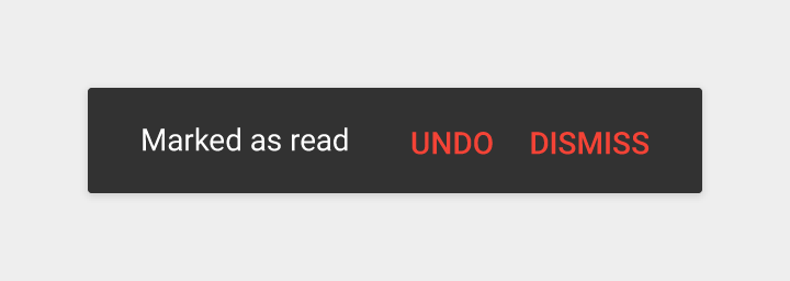
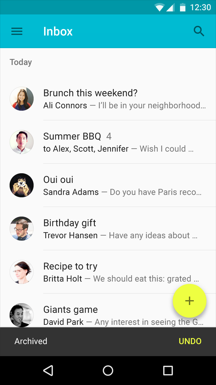
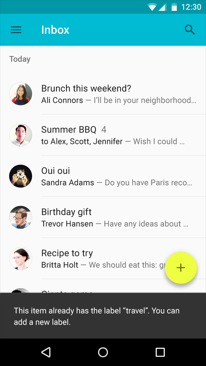
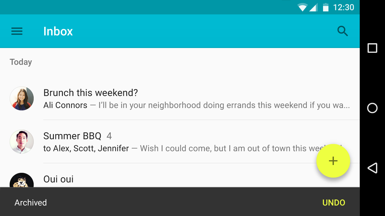
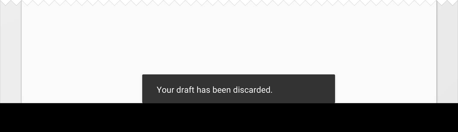
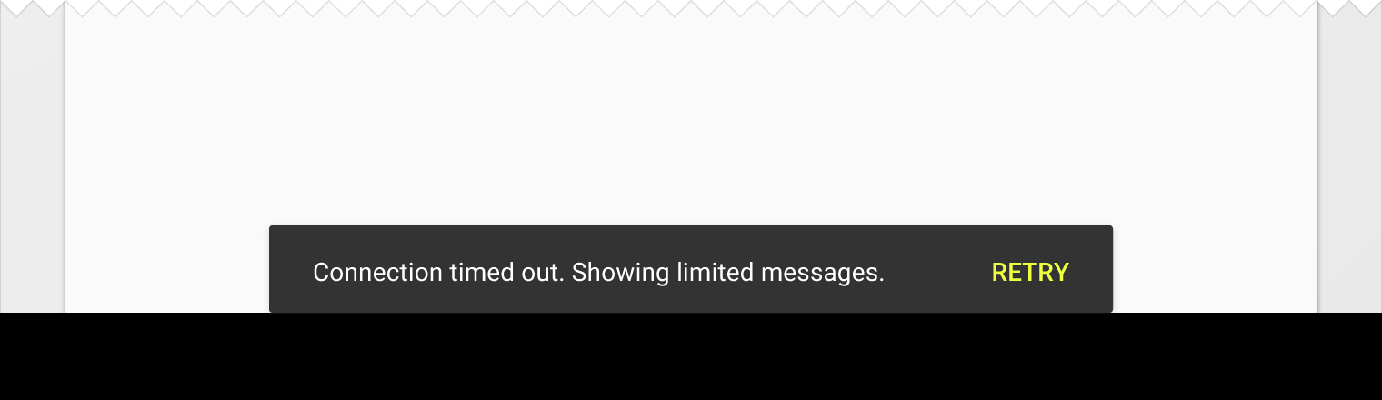
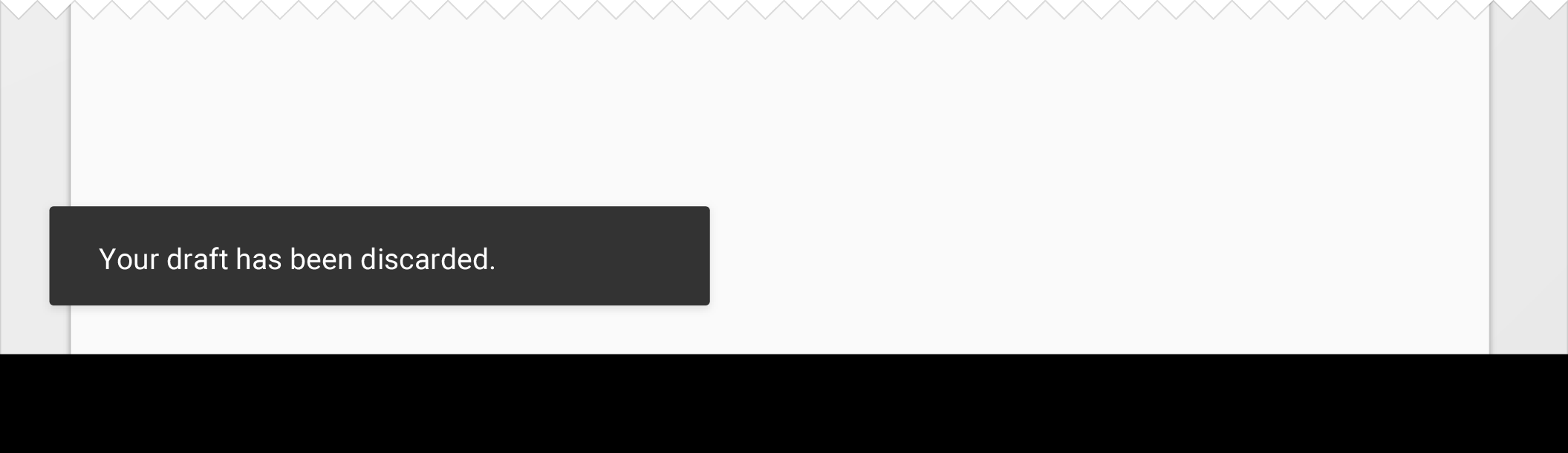
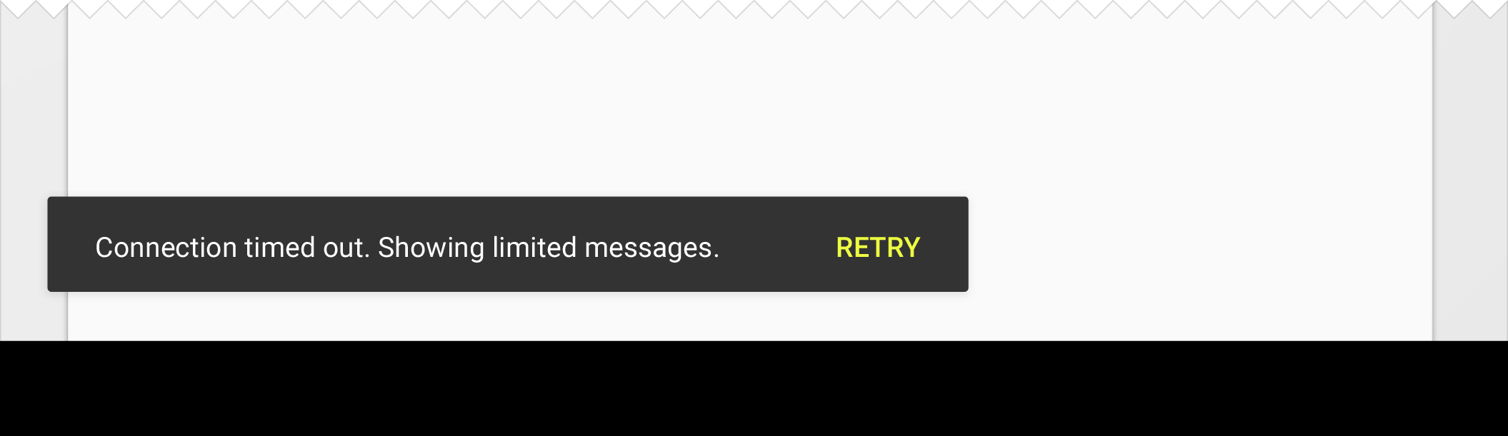
Snackbars provide brief feedback about an operation through a message at the bottom of the screen.
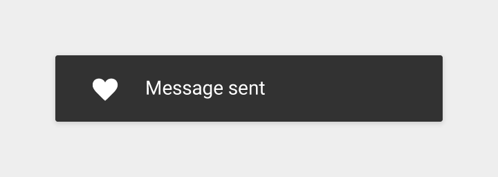
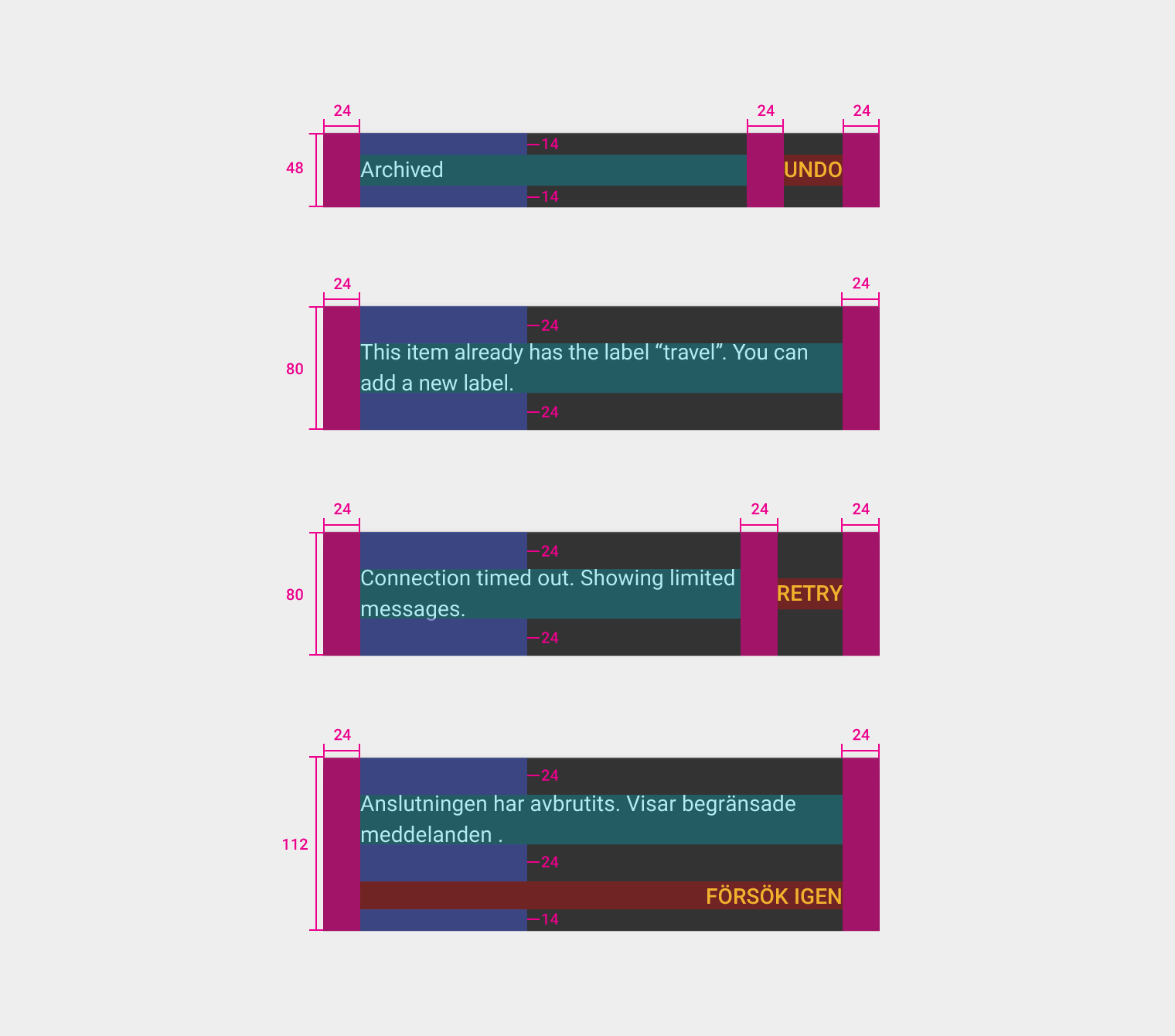
Snackbars contain a single line of text directly related to the operation performed. They may contain a text action, but no icons.
Toasts (Android only) are primarily used for system messaging. They also display at the bottom of the screen, but may not be swiped off-screen.
Usage
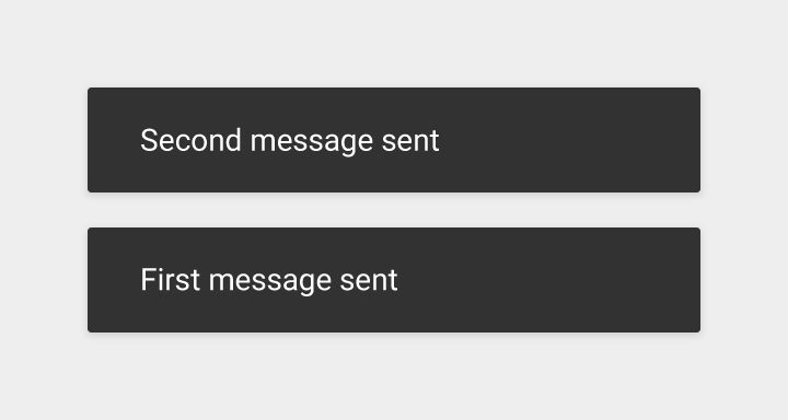
Only one snackbar may be displayed at a time. Each snackbar may contain a single action, neither of which may be “Dismiss” or “Cancel.”
Behavior
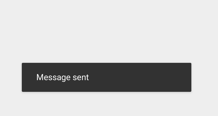
Snackbars animate upwards from the bottom edge of the screen.
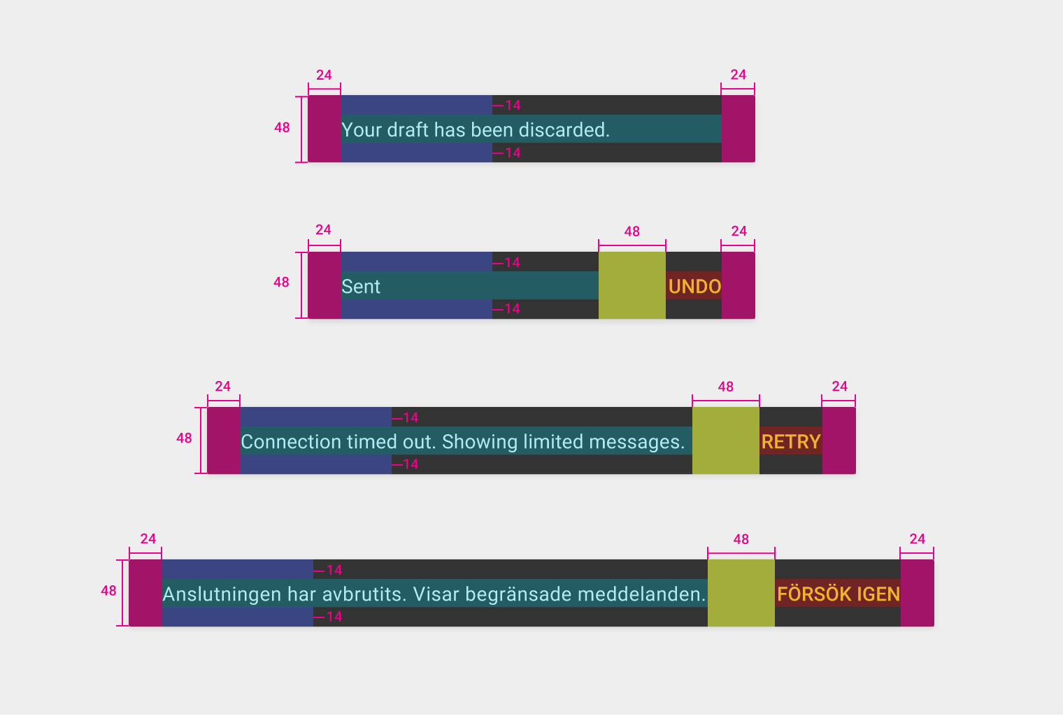
Snackbar specs
- Action button: Roboto Medium 14sp, all-caps text
- Mobile height: 48dp (single-line), 80dp (multi-line)
- Desktop snackbar height: 48dp