Components Grid lists

Grid lists

Grid lists are an alternative to standard list views.

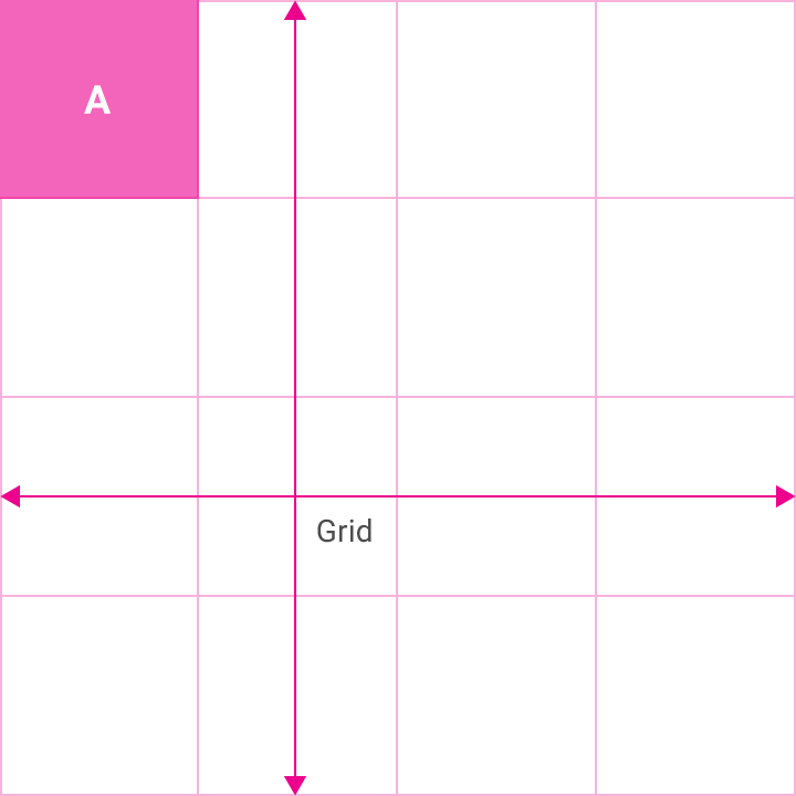
A grid list consists of a repeated pattern of cells arrayed in a vertical and horizontal layout.

Grid lists are best used on similar data types. They help improve the visual comprehension of the content they contain.

Types

Image-only
Single-line text (or with icon)
Two-line text (or with icon)

Actions

Vertical scrolling
Filtering

Alternatives

Lists
Cards

Usage Expand and collapse content An arrow that points down when collapsed and points up when expanded.

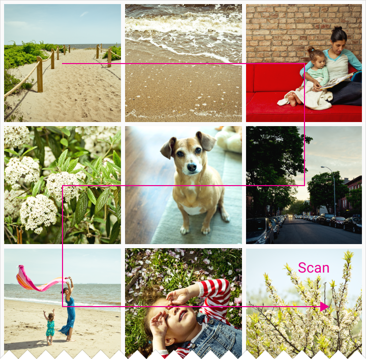
A grid list is best suited to presenting homogenous data, typically images, and is optimized for visual comprehension and differentiating between similar data types.

Example of grid list

A grid list consists of a repeated pattern of cells arrayed vertically and horizontally within the grid list.

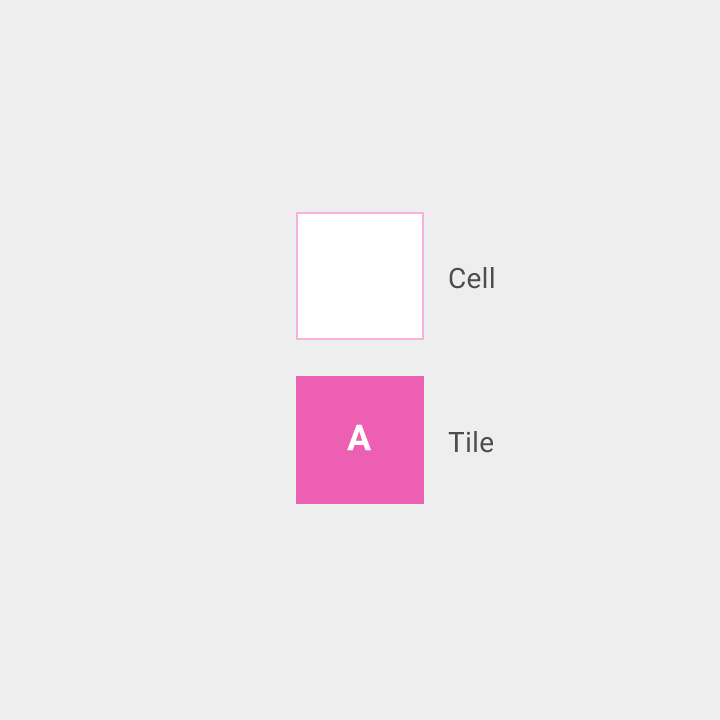
Tiles hold content and can span one or more cells vertically or horizontally.

Example of grid list

Example of a cell and tile

If the text in tiles needs to be prominent enough to distinguish between primary content pieces, consider using a different container, like a list or cards, optimized for displaying text and facilitating reading comprehension.

Lists: Optimized for reading comprehension, particularly when comparing a set of data containing multiple data types.

Cards: Used for content with inconsistent formatting, such as photos with captions of variable length, or data sets with heterogeneous content, such as a mixed collection of photos and videos and books.

Content Expand and collapse content An arrow that points down when collapsed and points up when expanded.

Content in tiles

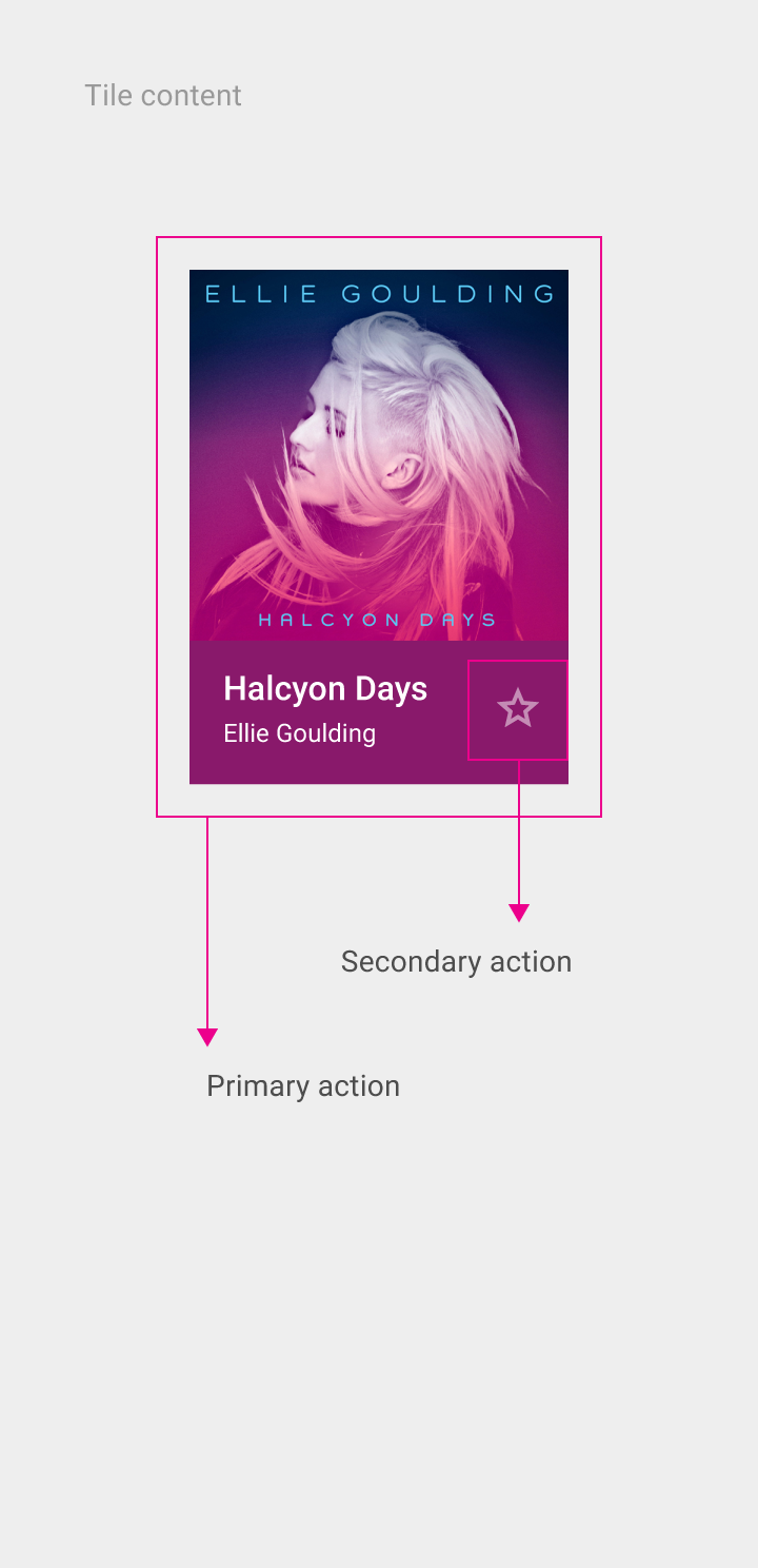
Tile content consists of primary content and secondary content. Primary content is the main differentiating element, typically an image. Secondary content can be an action or text.

Provide a default image for tiles that lack an image for primary content.

Example of tile content with primary and secondary actions

Actions in tiles

Actions on both primary and secondary content – such as play, zoom in, delete, or select – are immediate and typically do not result in a submenu of options (action overflow) within the grid list.

Actions can open a subsequent view, such as a card.

Primary actions

  • Fill the entire tile and therefore are not represented via icons or text
  • Are consistent throughout tiles in a specific grid list. For example, the primary action for all tiles in a single grid list could be to view details for an image.

Secondary actions or content

  • Are represented in tiles with icons or text
  • Are consistent throughout tiles in a specific grid list
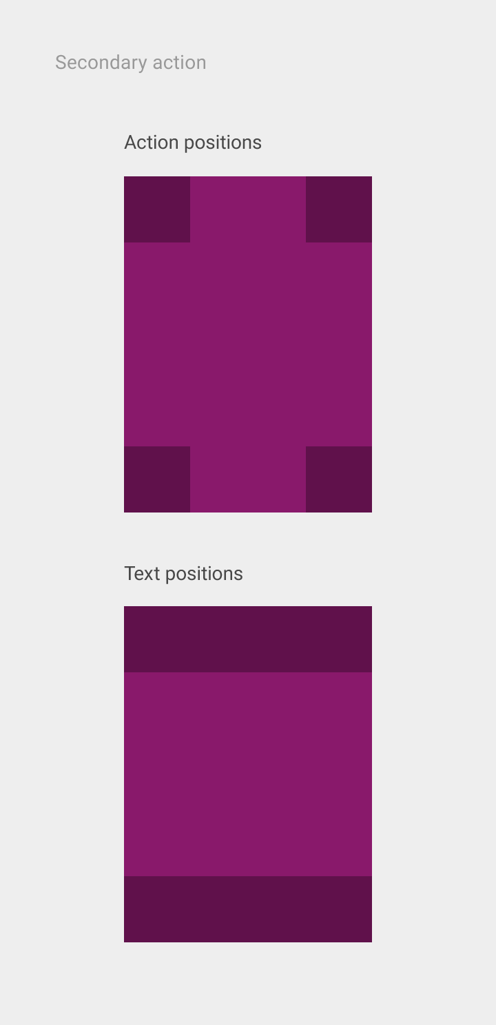
  • Are placed in a consistent location within the tiles of a specific grid list, but that consistent location may vary between grid lists (at corners or edges). For example, all titles in one grid list could be located at the bottom left corner, while all tiles in another grid list might place titles in the top left corner.

Example of secondary action with action and text positions

Behavior Expand and collapse content An arrow that points down when collapsed and points up when expanded.

Scrolling

Grid lists typically scroll only vertically.

Horizontally scrolling grid lists are discouraged because the scrolling interferes with typical reading patterns, affecting comprehension. One notable exception is a horizontally-scrolling, single-line grid list of images, such as a gallery, which is compatible with typical reading patterns.

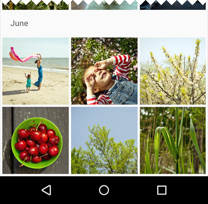
Cut off grid tiles in the view’s initial scroll position to communicate the scroll direction for content overflow.

Do.

Indicate content overflow by cutting off grid tiles.

Don’t.

Avoid aligning grid tiles along a view edge in the view’s initial scroll position. This positioning doesn’t effectively communicate that there is more content available.

Gestures

Per-tile swipe actions are not permitted. Pick-up-and-move actions are discouraged.

Tile filtering and sorting

Content in a grid list can be programmatically filtered or sorted by date, file size, alphabetical order, or other parameters.

The first item in the grid list is positioned at the top left of the grid list, and the order proceeds left to right and top to bottom.

Dimensions and resizing

Resizing a grid list causes the tiles to re-sort as horizontal space becomes available. Full-bleed grid list tiles resize to fit the screen width.

A grid list does not transform into a list when horizontal space contracts. Grid lists and lists are separate structures for emphasizing different data types. Grid lists prioritize images over text and lists prioritize text over images.

To maintain a consistent rhythm throughout the grid list, truncate text content that is too long for the tile’s width. Alternatively, increase the grid size so that the tiles can accommodate the longer titles.

Responsive design

Full-screen grid lists should use fluid image ratios with minimum and maximum widths, derived using the Ratio keylines. They should retain fixed heights, margins, and padding.

Centered grid lists have fluid margins with a minimum width. They maintain fixed image widths, heights, and padding.

Specs Expand and collapse content An arrow that points down when collapsed and points up when expanded.

Grid list header/footers

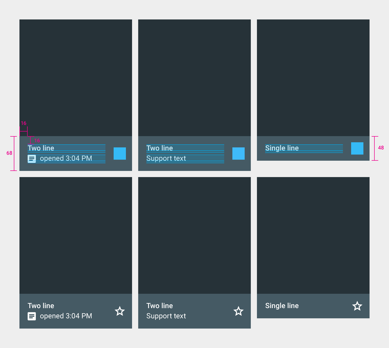
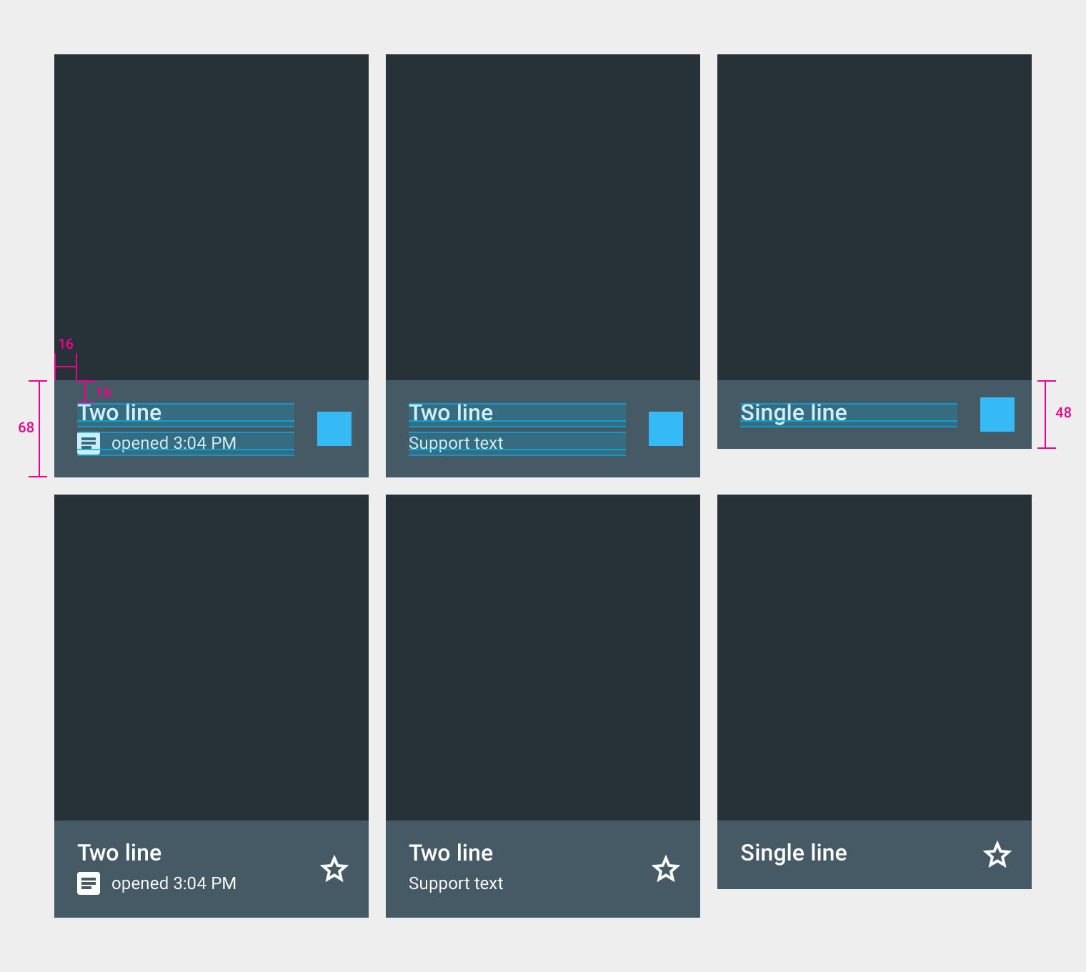
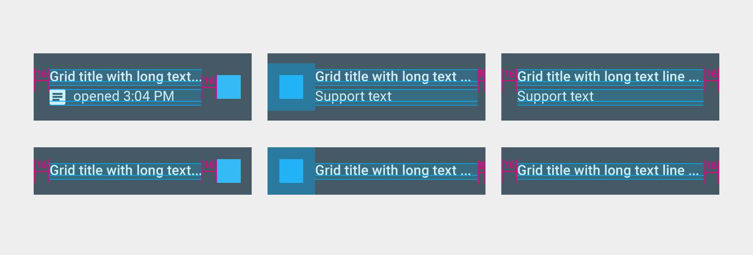
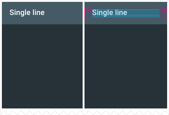
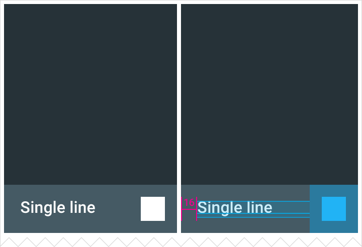
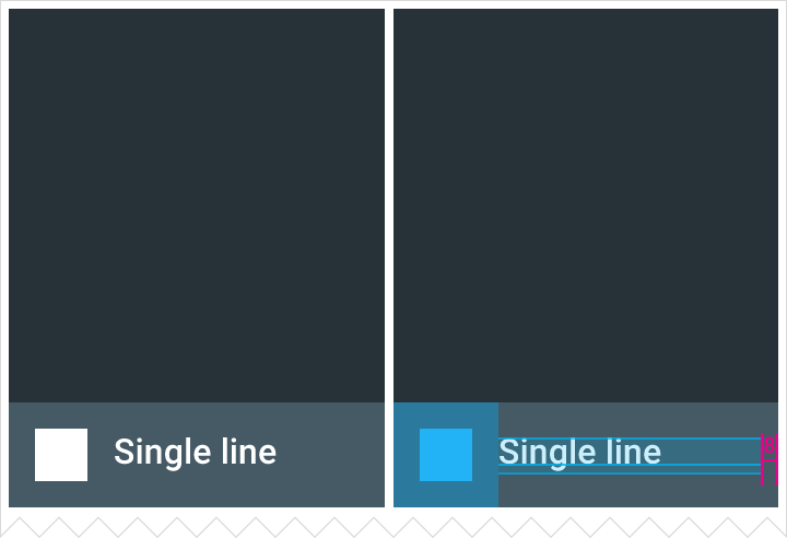
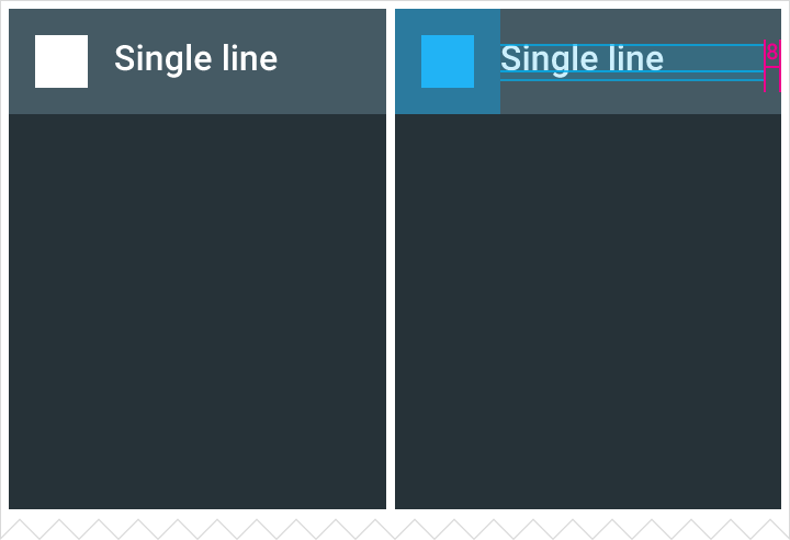
Single-line header/footer

Height: 48dp
Text padding: 16dp
Default font size: 16sp
Secondary action is flush right to the footer.

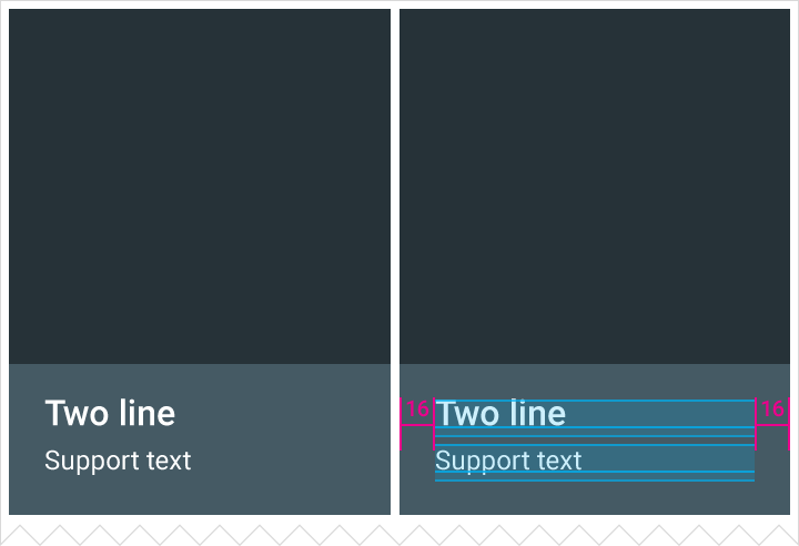
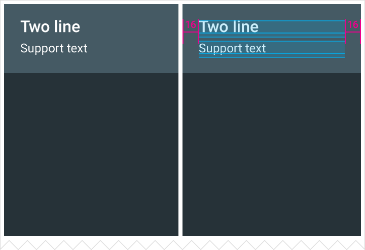
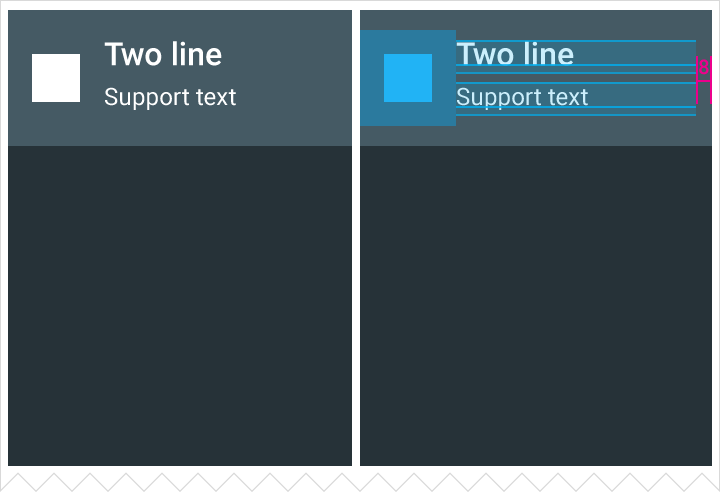
Two-line header/footer

Height: 68dp
Text padding: 16dp
Default font size for each line: 16sp/12sp or 14sp/14sp


Type 14/14
Two-line bar (with icon) height: 68dp
Two-line bar height: 68dp
Single-line bar height: 48dp


Type 16/12
Two-line bar (with icon) height: 68dp
Two-line bar height: 68dp
Single-line bar height: 48dp

Text truncation in header/footers.

Image-only grid list

Grid list padding: 4dp or 1dp

Tiles in grid lists can span multiple columns.

Carefully consider whether secondary text is needed in grid lists that use multi-column tiles, as larger tiles can develop significant empty space.

Image-only grid list

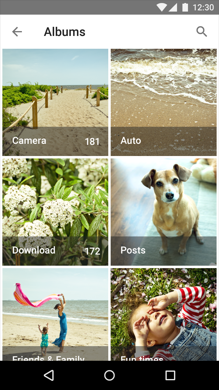
Image-only grid list photo album

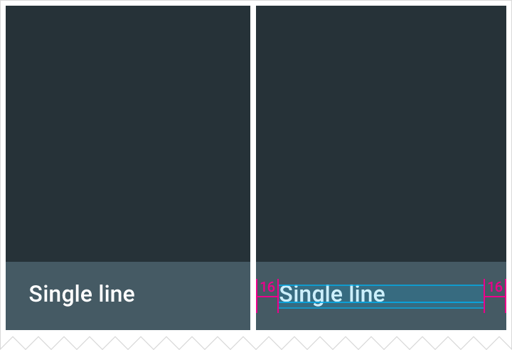
Single-line grid list

Text only

Height: 48dp
Text padding: 16dp
Default font size: 16sp
Grid list padding: 4dp or 1dp

Single-line grid list footer with 16dp padding

Single-line grid list header with 16dp padding

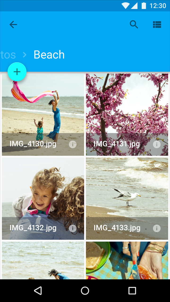
Single-line grid list photo album

Text with icon

Height: 48dp
Text padding: 16dp
Default font size: 16sp
Grid list padding: 4dp or 1dp

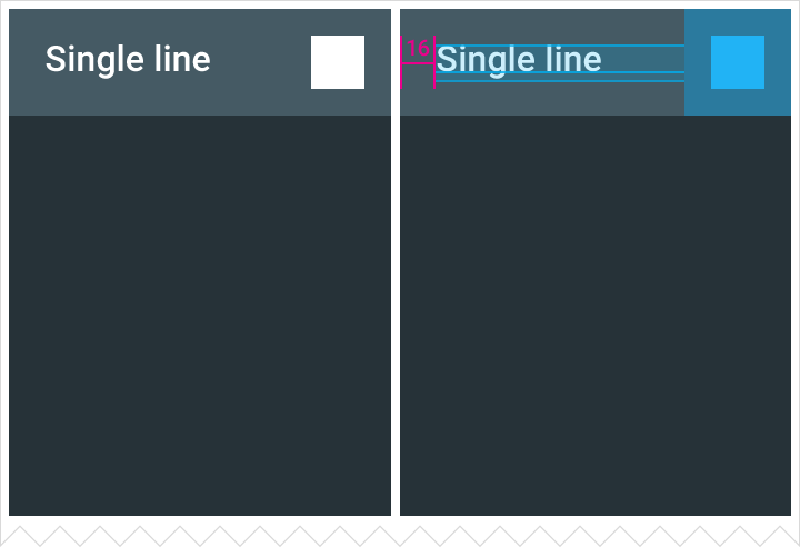
The secondary action can be flush right or flush left within the footer or header.

Single-line grid list footer with 16dp padding and icon

Single-line grid list header with 16dp padding and icon

Single-line grid list footer with icon in photo album

Single-line grid list footer with icon

Single-line grid list header with icon

Two-line grid list

Text only

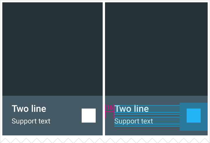
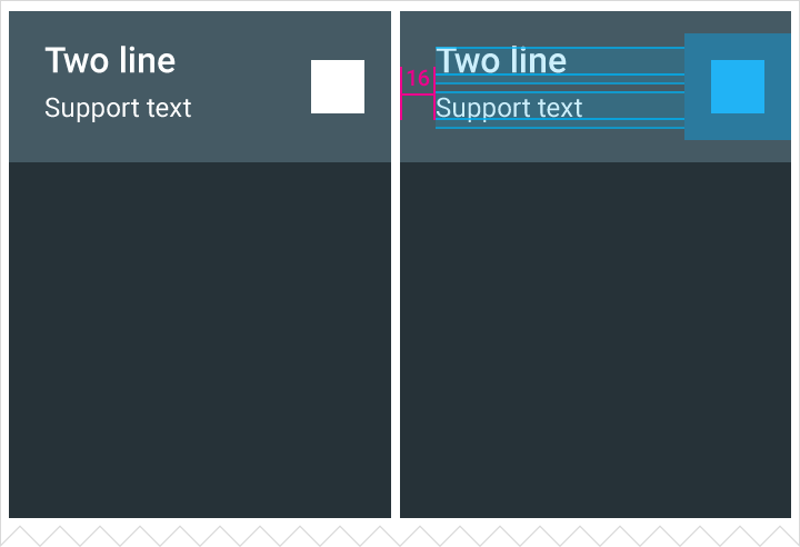
Height: 68dp
Text padding: 16dp
Default font size for each line: 16sp/12sp or 14sp/14sp
Grid list padding: 4dp or 1dp

Two-line grid list footer with 16dp of padding

Two-line grid list, 4dp example

Two-line grid list header with 16dp of padding

Two-line grid list, 1dp example

Text with icon

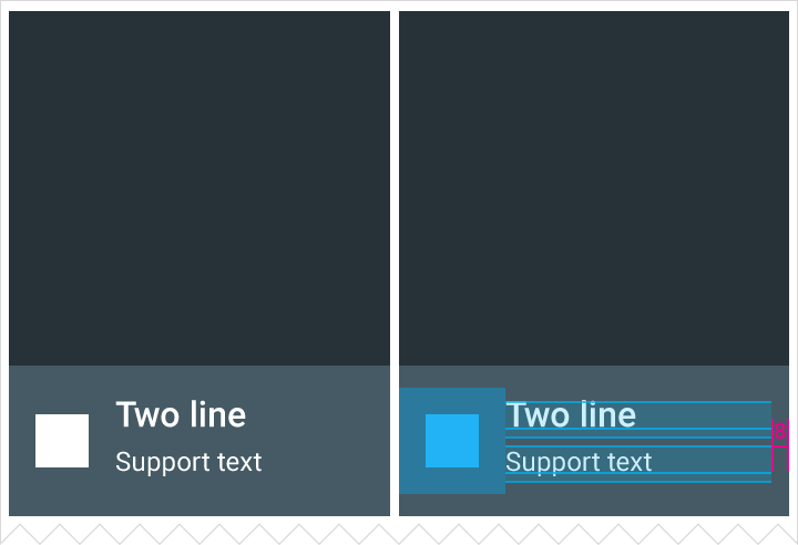
Height: 68dp
Text padding: 16dp
Default font size for each line: 16sp/12sp or 14sp/14sp

The secondary action can be flush right or flush left within the footer or header.

Grid list padding: 4dp or 1dp

Two-line text with icon footer

Text padding: 16dp

Two-line text with icon header

Text padding: 16dp

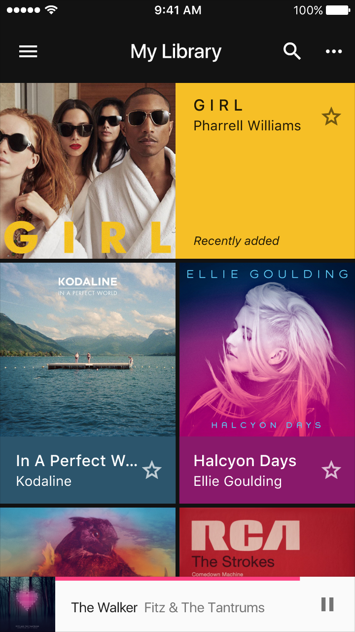
Example of text with icon

Two-line text with icon

Two-line text with icon